SteemX Development Update: New Design for SteemX Metrics
Hello Steemians,
This update is about one feature called SteemX Metrics. The old page worked, but it did not look good. It had too many colors, the numbers were small, and it was hard to find what you wanted. We rebuilt the design from the top to the bottom.
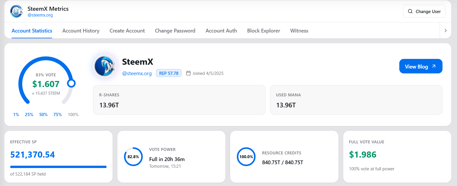
What we changed
1. Header and tabs
- The big gradient banner is gone. The header is now a clean card.
- The tabs (Account Statistics, Account History, and others) now show a simple line under the active tab.
2. Profile and vote calculator
- The profile picture, name, reputation and join date are now in one card with the vote calculator.
- The vote slider is now a circle dial. You turn it to pick the vote weight, and the vote value shows in the middle.
- If you move the dial, it goes back to the real vote power of the account after 5 seconds. So the page always ends on the true value.
3. Key numbers at the top
Four small cards show the most important numbers:
- Effective SP
- Vote Power (with the time until it is full)
- Resource Credits
- Full Vote Value
4. Rewards Summary (new)
A new table shows rewards for All Time, Last 30 Days and Last 7 Days:
- Curation SP, Author SP, STEEM, SBD and Producer SP
- Total value in USD, using the market price
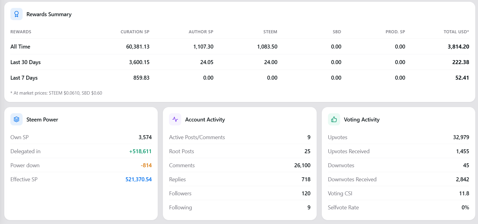
The data comes from the SDS API by @steemchiller.
5. Account History
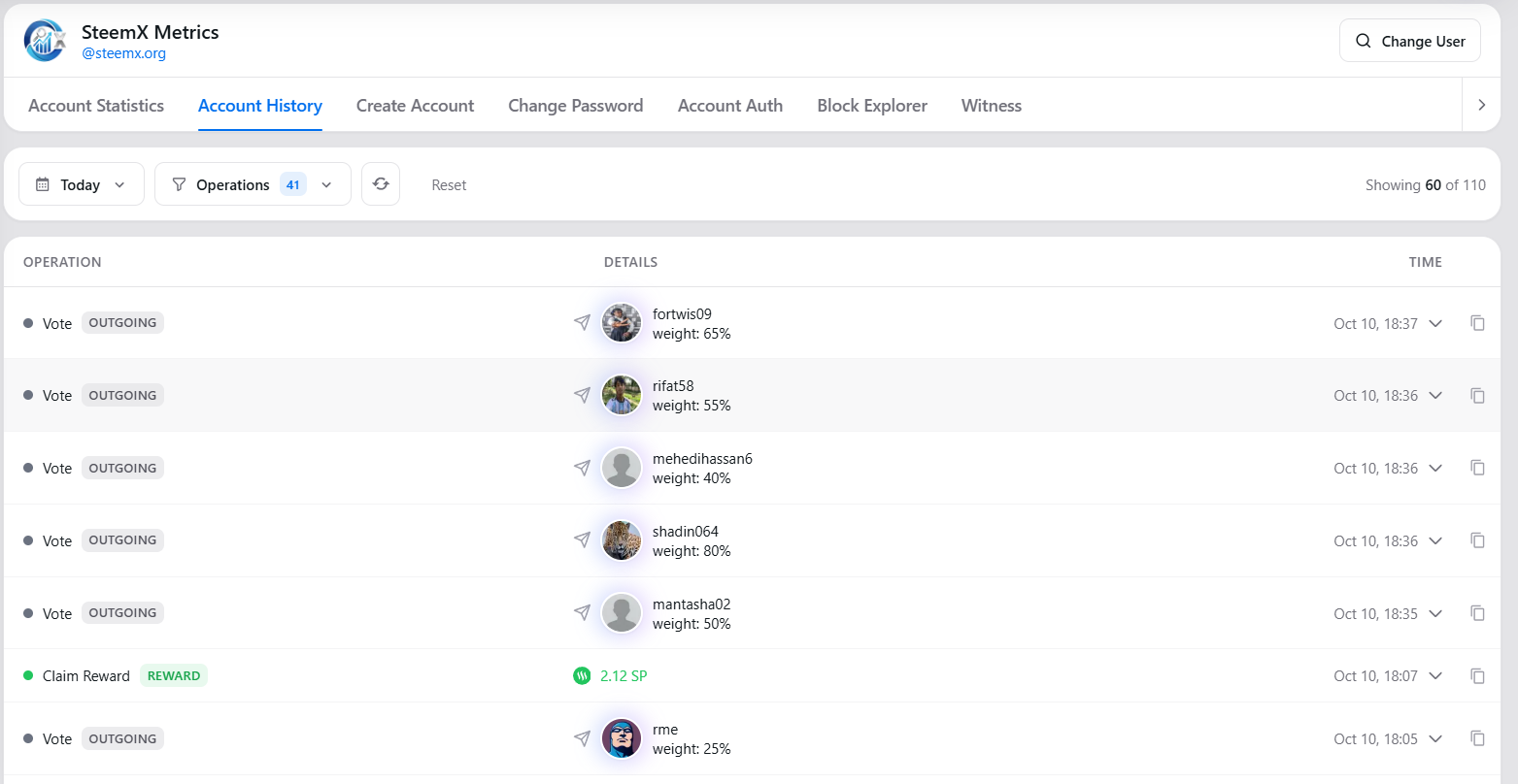
- The filter buttons have a cleaner look.
- Tags like REWARD, WITNESS and VIRTUAL are now soft colored labels.
- New, lighter icons. Transfers now show a clear incoming (green) or outgoing (red) icon.
- A row opens and closes with a smooth animation. Only one row stays open at a time.
- If there are no transactions, the page now says so. Before, it showed nothing.
6. Change User window
- It now shows the profile picture of the name you type.
- Popular accounts show their pictures too.
7. Smaller profile pictures
All profile pictures on SteemX now load in a small 64px size. Each picture is about 4 KB. Before it was about 11 KB. This helps pages with many pictures, like feeds and voter lists.
Why the new design is better
- Easy to read. Important numbers are big and at the top.
- One style. Every card uses the same background, the same color and the same spacing.
- Works in light and dark mode. The cards follow the theme of the site.
- Works on mobile. Cards stack under each other on a small screen.
- More information. The Rewards Summary was not on the page before.
- Less data to load. Smaller profile pictures mean less to download.
What we still need to improve
- Other tabs. Create Account, Change Password, Account Auth, Block Explorer and Witness still have the old look inside. They are next.
- Recent Rewards. We want to add a list of the latest rewards next to the summary.
- Profile picture caching. Right now the browser asks for each picture again every 10 minutes. We plan to keep pictures in the browser and only load a new one when the user changes it.
- Large profile pictures. The 64px picture can look a little soft in big places, like the profile page. We will check these places.
- More testing. We need more tests on phones and in dark mode.
- Languages. The Metrics page is still only in English.
Your feedback
Please try the new Metrics UI and tell us what you think. If something looks wrong or is hard to use, leave a comment. Your feedback helps us decide what to fix first.
Thank you for supporting SteemX.