Capturing a packaging design
Thumbnail

Greatings to all friends! |
|---|
Hi to our vibrant community and supportive moderators |
|---|
Today I am sharing a topic that is a common part of our daily lives. But we often do not pay much attention to it. And that is product packaging. The packaging of any product is not just to keep it safe. But its design color shape and presentation play a very important role in grabbing our attention. Sometimes as soon as we see a product. Its beautiful packaging catches our eye. With this idea in mind. I have selected Marhaba 100% Pure Honey Coca Cola and Bake Time Cake Slices from the various products around me.

- Why did this packaging catch my eye?
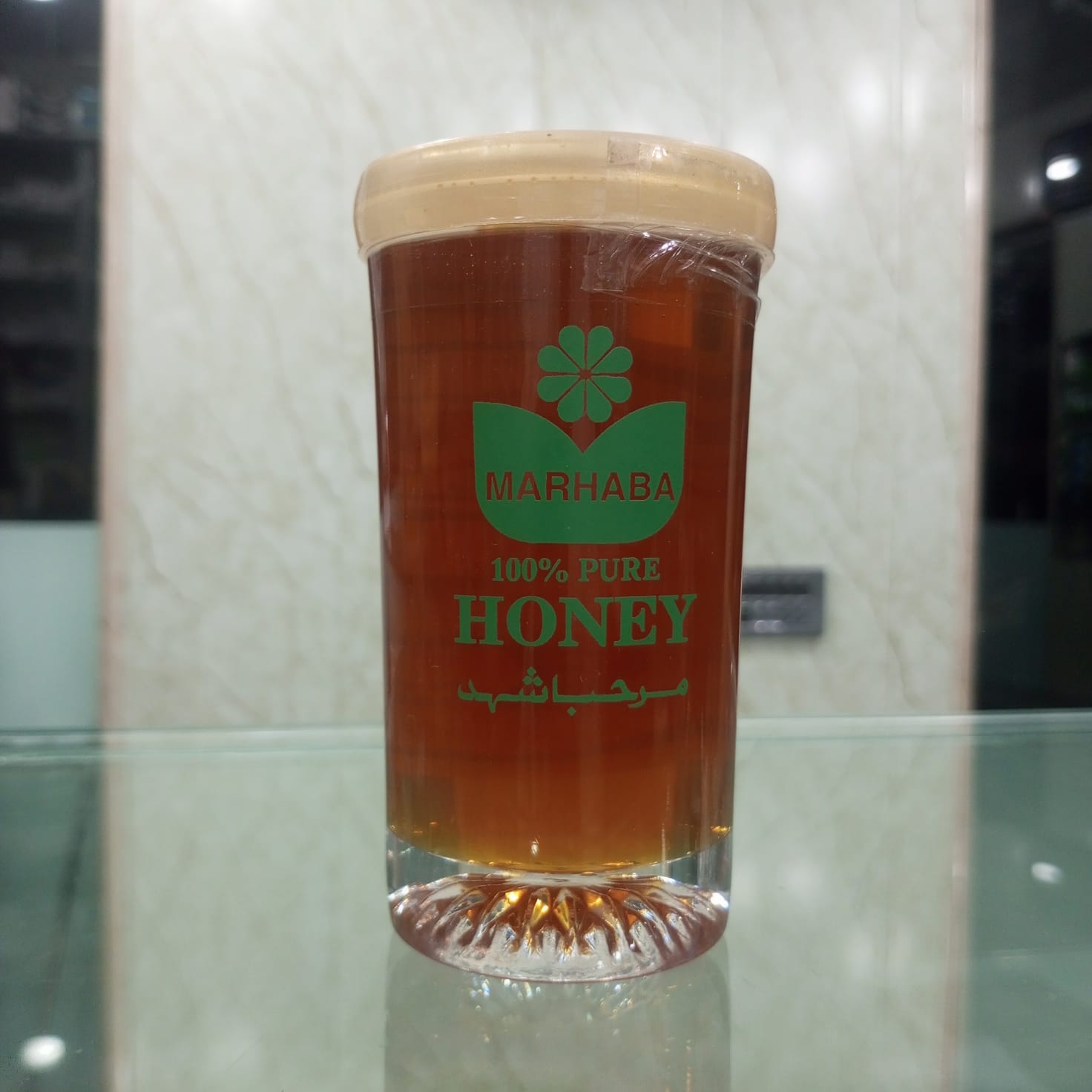
The first packaging that caught my attention was Marhaba 100% Pure Honey. I found the most beautiful thing about its packaging to be its transparent bottle. Because through it the natural golden color of the honey inside is clearly visible. I think this is a great packaging idea. Because when a person looks at the bottle. He also gets the opportunity to see the product from inside.
I also liked the green color on it a lot. Green color is usually associated with nature and freshness. So this color gives a natural feeling with honey packaging. Its logo and label are also simple but clear. Due to which the bottle does not look too complicated. Apart from this. The shape of the bottle is also practical and it feels easy to keep or use it in the kitchen.
- If I could add a slogan to this packaging, what would it be?
If I had the chance to write my own slogan on this packaging. I would write:
“Nature’s Golden Sweetness” 🍯
I chose this slogan because both the beautiful golden color of honey. And its natural sweetness are reflected in this one sentence. I think it’s short simple and matches the concept of the packaging very well.
- Why did this packaging catch my eye?
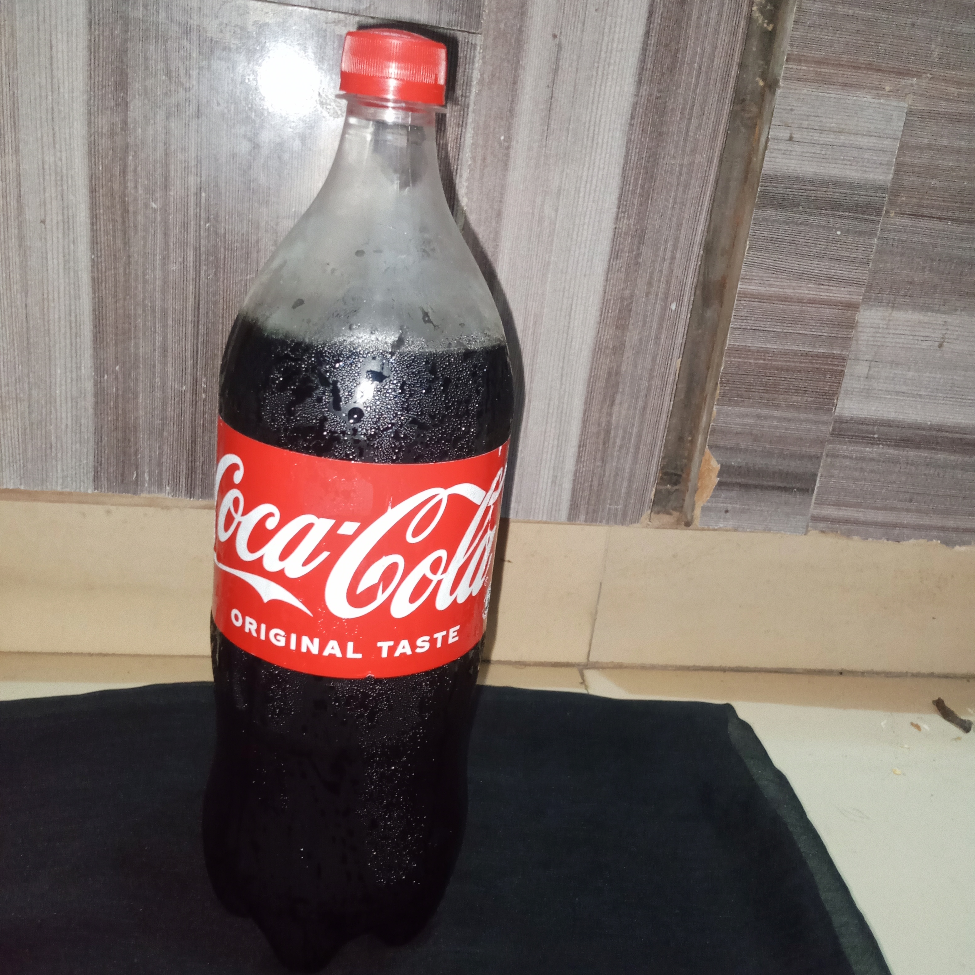
My second selection is Coca-Cola. Coca-Cola’s packaging as always caught my attention this time too because of its bright red color. Its red and white combination is very prominent. And it is immediately recognizable upon seeing the bottle. I think this is the special thing about good packaging that it makes. Product recognizable even from a distance.
The white logo on this bottle is very visible on the red background. Its design is not very complicated. But still memorable. The shape of the bottle is also such that it is easy to hold in the hand. While the cap allows it to be closed again after opening. I liked the simplicity. And strong branding of this packaging the most.
- If I could add a slogan to this packaging, what would it be?
If I had the chance to create my own slogan for Coca-Cola. My slogan would be:
“Open the Bottle Feel the Moment” 🥤
I think this slogan is not just about the drink. But about the feeling you get when you open a refreshing drink. It’s a simple and energetic line that would go well with Coca-Cola’s lively packaging.
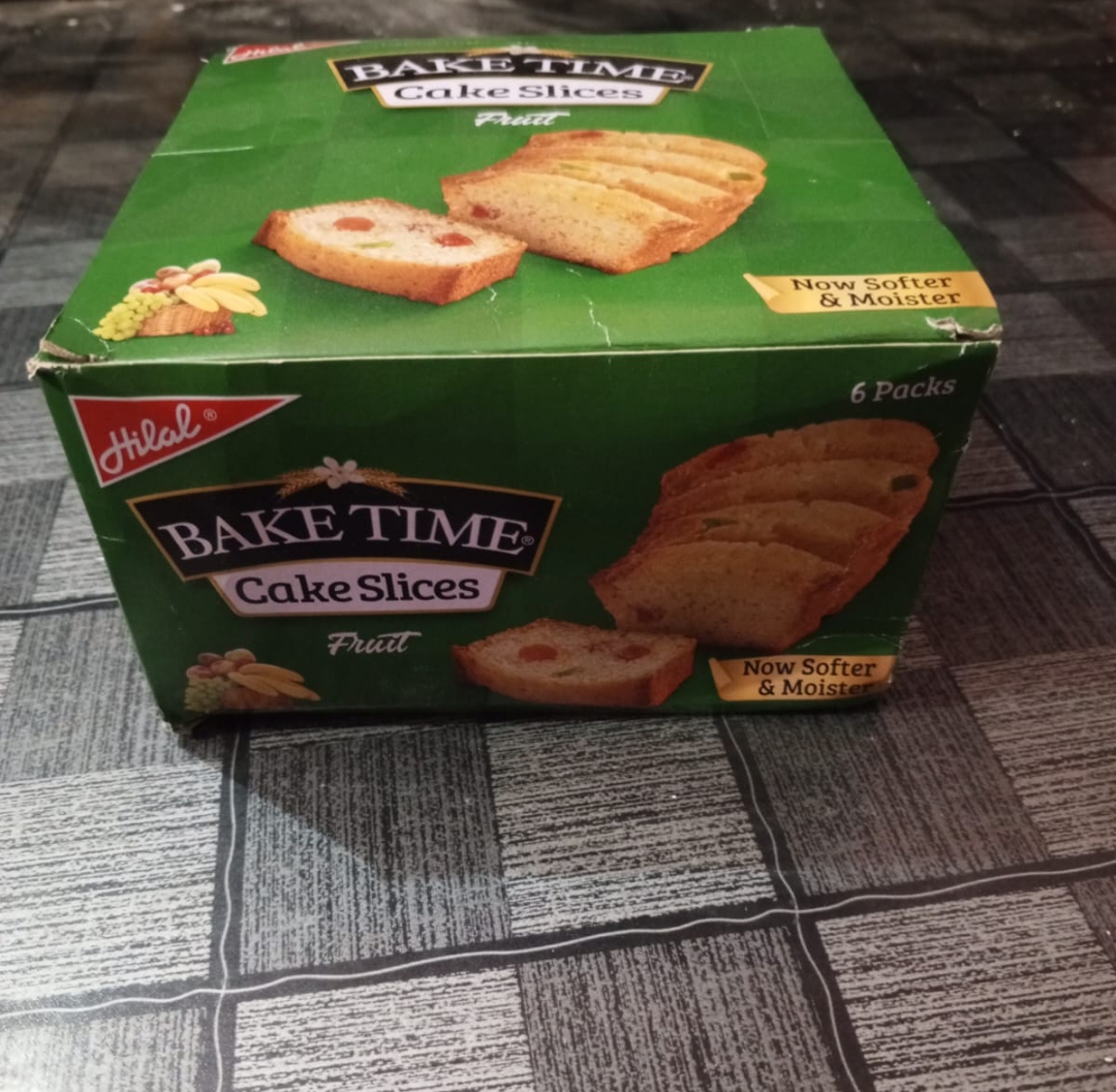
The third packaging that caught my attention was Bake Time Cake Slices. The green color of this box caught my eye first. I found its overall design quite attractive. Because it also has clear and appetizing pictures of the cake. When we look at the packaging of a food product. The picture of the food on it increases our desire and curiosity. And I felt the same with this box.
The packaging has “Cake Slices” and other product information clearly present. Due to which the customer gets the basic idea about the product immediately. I also liked the fact that the design of the box does not feel too crowded. The picture of the cake stands out well with the green background. And gives the entire packaging a pleasant look. Its box packaging is also practical because it is more suitable for storing. And preserving cake slices than a box bottle. For me the best thing about this packaging is its combination of colors. Food presentation and clear information.
- If I could add a slogan to this packaging. what would it be?
If I had the chance to make a slogan for it. I would write:
“A Little Slice of Happiness” 🍰
I chose this slogan because cake is not just a food item. But is often a part of our little joys. A delicious cake slice can make tea family time. Or any special time more enjoyable.
After looking at these three products closely. I realized that packaging plays a very important role in making a product recognizable. Marhaba Honey’s natural and simple presentation. Coca-Cola’s bold and recognizable red design. And Bake Time Cake Slices’ attractive and appetizing box. All three have their own unique characteristics.
To me good packaging is one that is beautiful and provides clear information about the product. Is easy to use, and grabs the customer’s attention at first glance. That’s why I chose these three different packaging designs for this contest. I think sometimes a beautiful packaging is enough to entice us to try a product for the first time.
Here is my post for today. Which I have shared with all my friends. See you in the next post.
Thank you for being with me.
|
|---|
Hola amiga.
La presentación de la miel es muy bonita y, además, tiene un doble uso, ya que después de consumirla podemos reutilizar el frasco para otra cosa. Sin duda alguna, la Coca-Cola se reconoce desde lejos por su característico color rojo. El empaque del pastel resulta muy llamativo por su color verde. Me gustaron tus eslóganes.
Gracias por participar en el concurso.