Colourful Steem Logo Design Drawing Competition 🎨
Assalamu'alaikum everyone.
I am @bimanakhan from #Bangladesh
Hello Steemit friends, how are you all? I hope you are all well, Alhamdulillah I am very well.
Creativity is a power that can turn even an ordinary idea into something extraordinary. For an artist, a white paper is not just a paper—it is a beautiful medium to express your thoughts, imagination, and feelings. When you draw something with your own hands, every line, every color, and every little detail gradually creates a complete story.
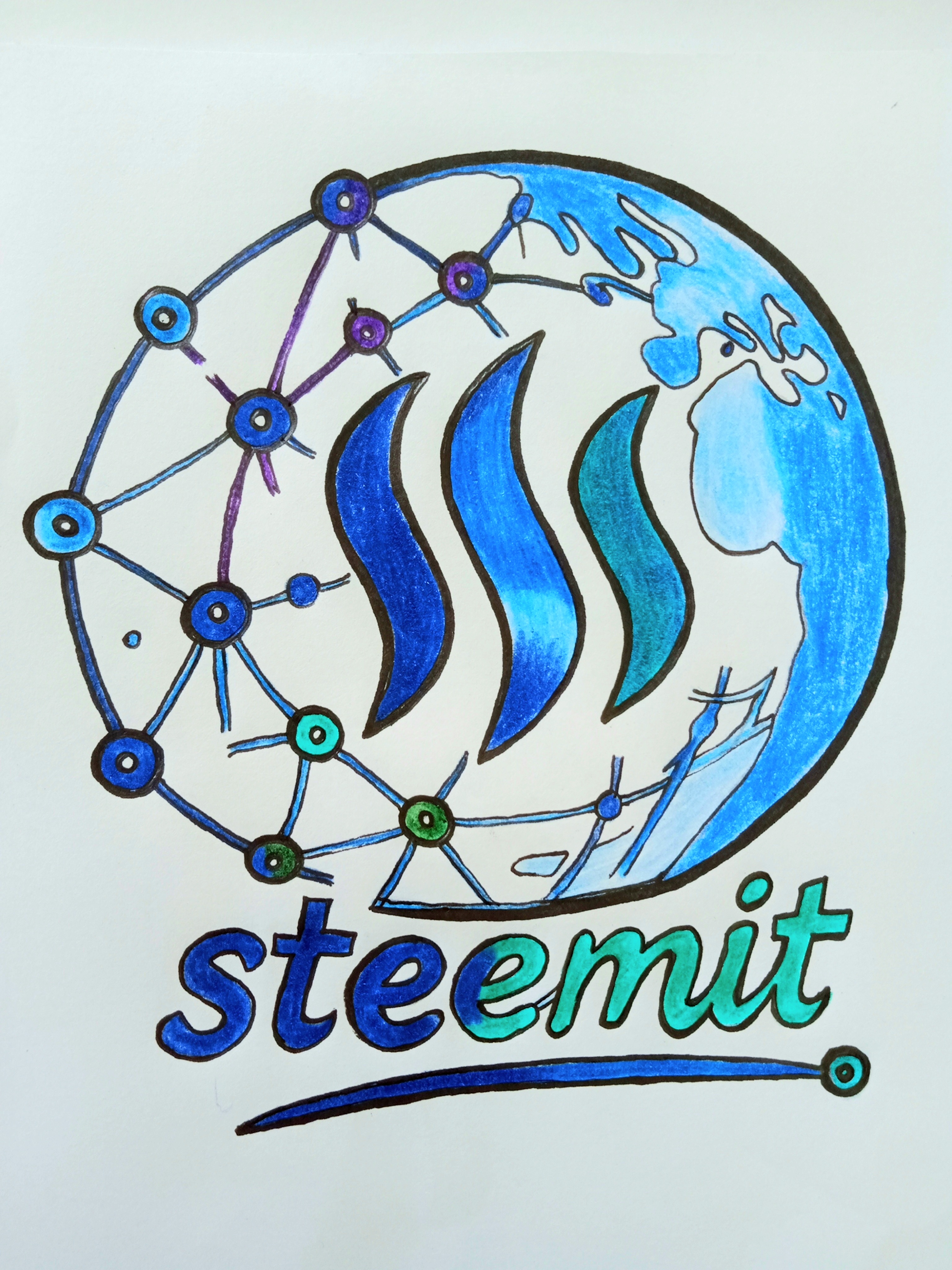
Today's Steemit logo design is also a story of my Estimate journey. So without further ado, let's take a look at the step-by-step process of Estimate logo design.
🛠️ Materials Used
- 📄 White Drawing Paper
- ✏️ Pencil
- 🖊️ Black Outline Pen
- 🖍️ Blue Colored Pencil
- 🖍️ Dark Blue
- 🖍️ Sky Blue
- 🖍️ Green and Turquoise
- 🖍️ Purple
- ✏️ Eraser
🎨 Step by Step My Steemit Logo Design
✏️ Step 1
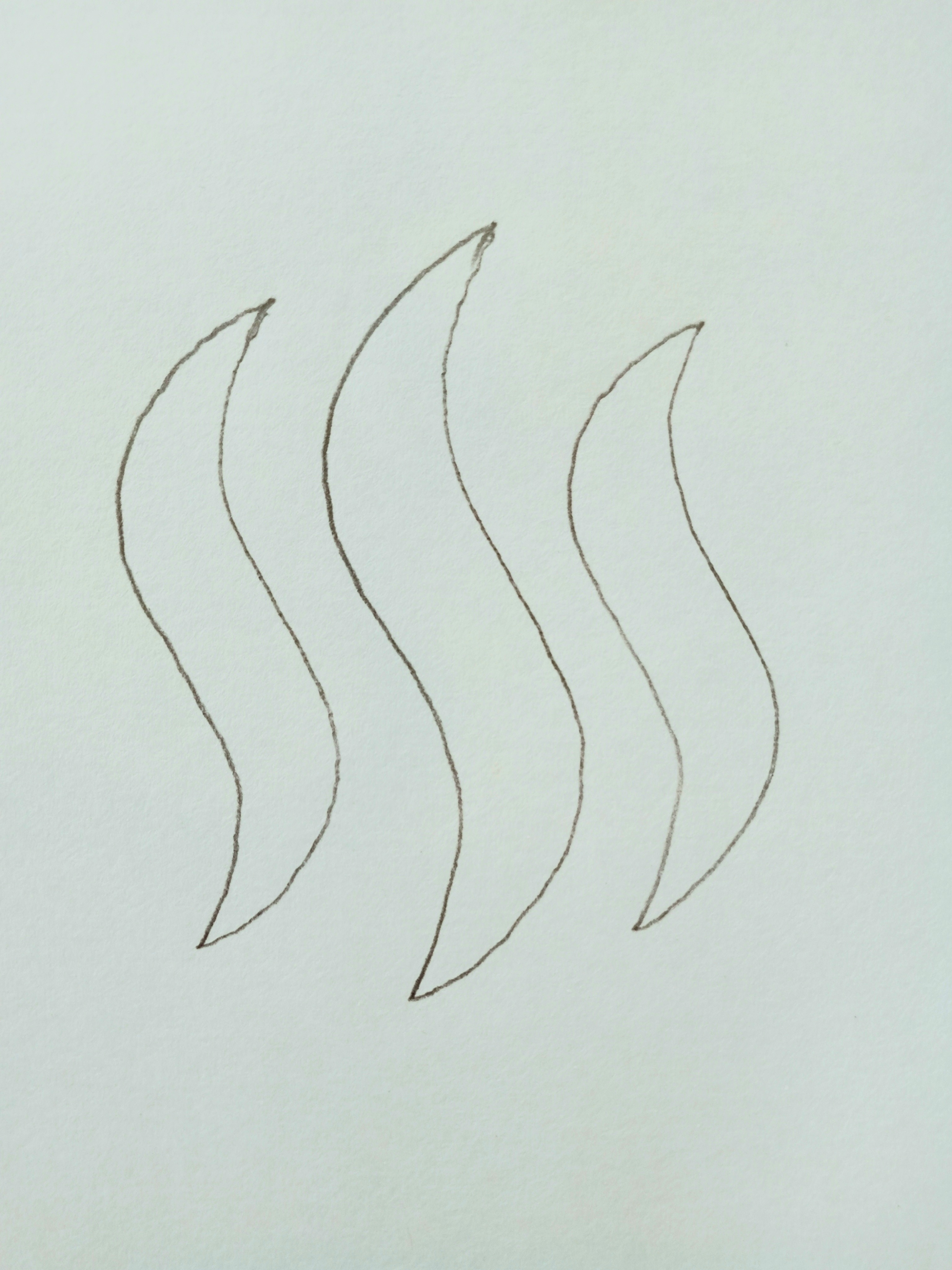
First, I drew the three curved parts of the main symbol of Steemit with a pencil on white paper. I tried to determine the shape of each part beautifully and arrange it evenly, so that the next step of coloring would be easier.
✏️ Step 2
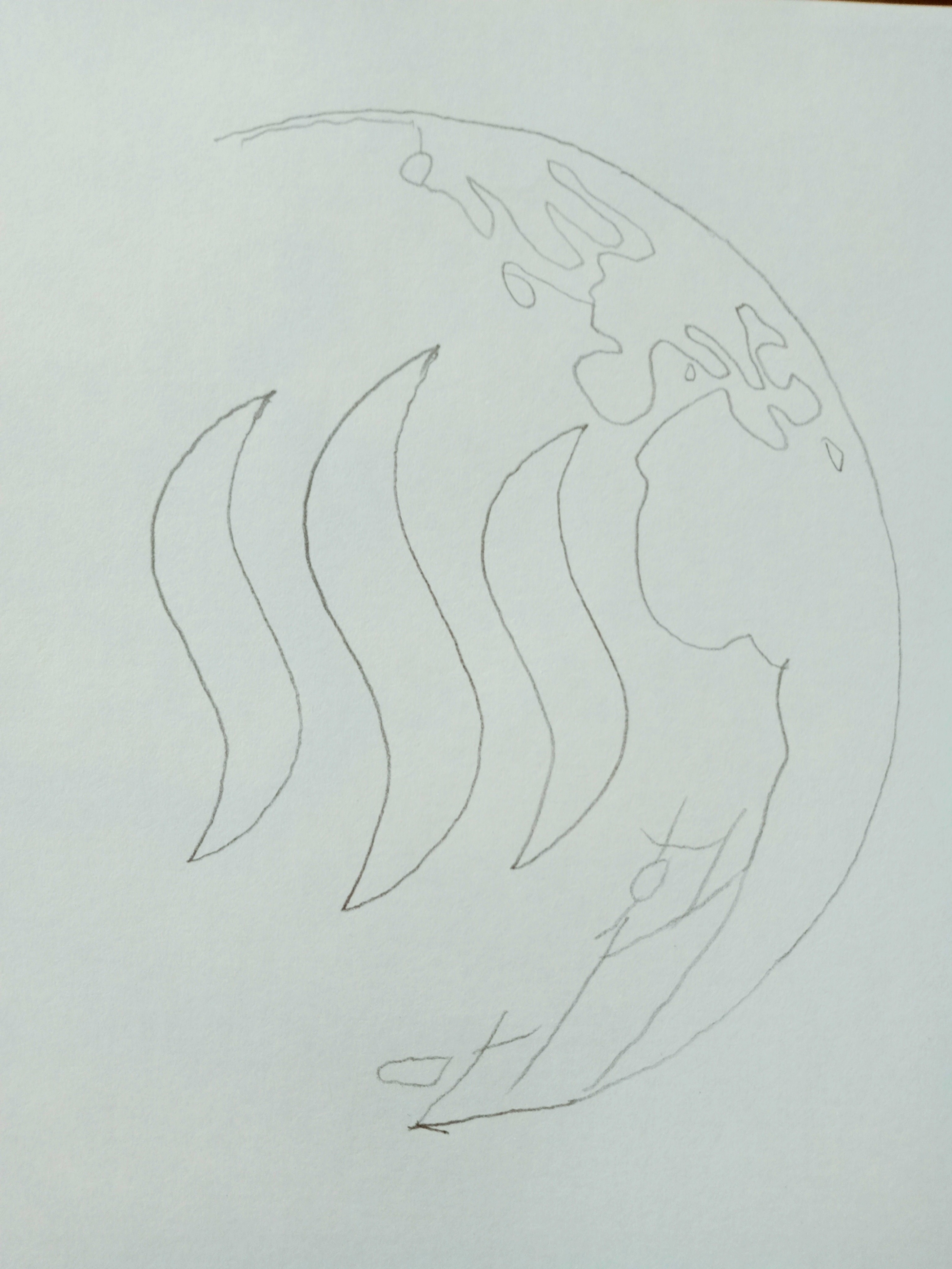
Then I drew the round shape of the world around the three symbols with a pencil. I also made some necessary lines at the bottom to show the shape of the continents and to show the different parts of the world.
✏️ Step 3
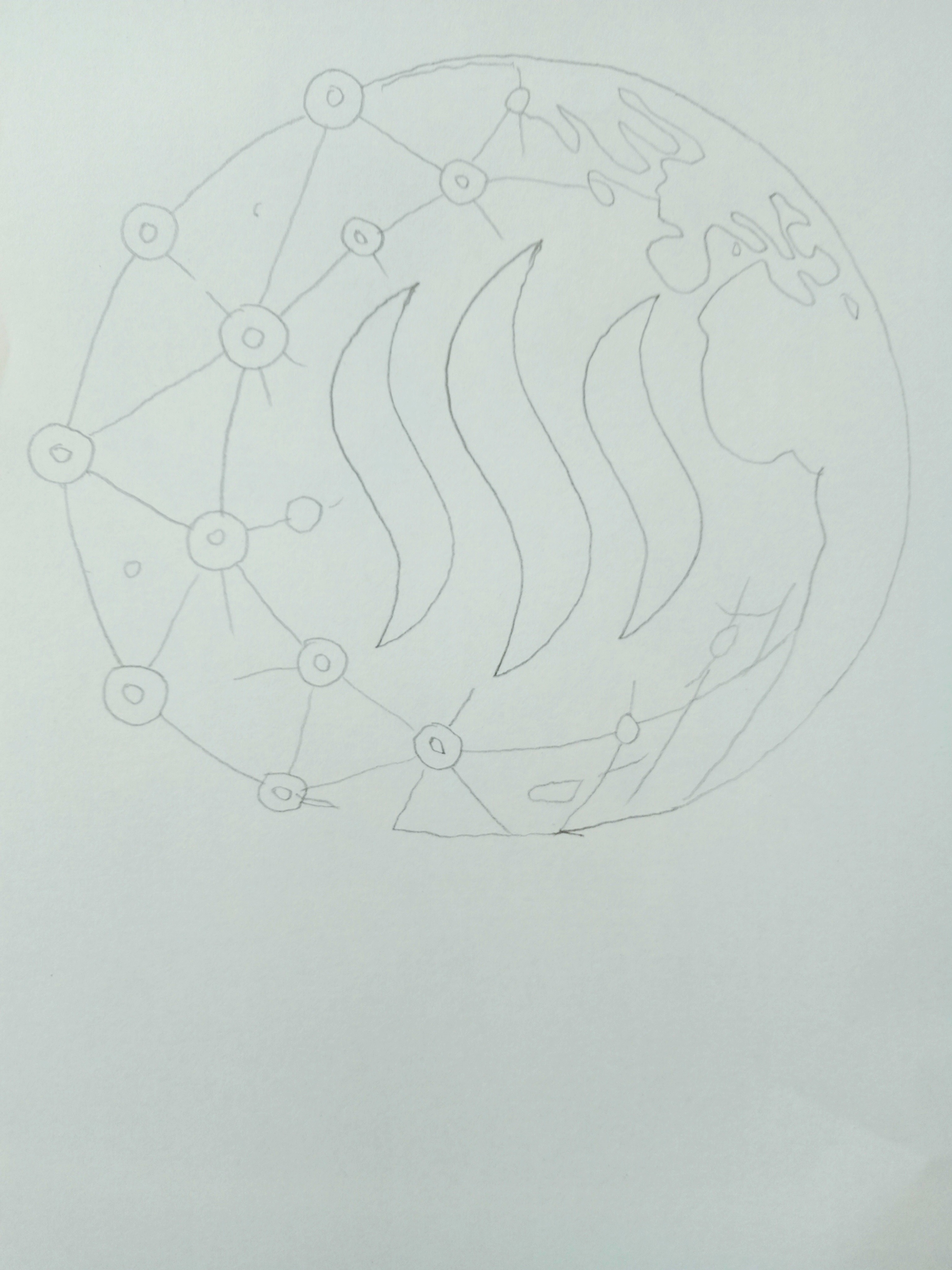
In this step, I created a network-like connection on the left side of the world. I drew small circular nodes in different places and connected them to each other with lines.
✏️ Step 4
Then I made the different parts of the entire sketch clearer. I fixed the outer boundaries of the world, the network connections, the continents and the necessary lines on the bottom, wrote the word Estimate below the design and also made a design below the writing.
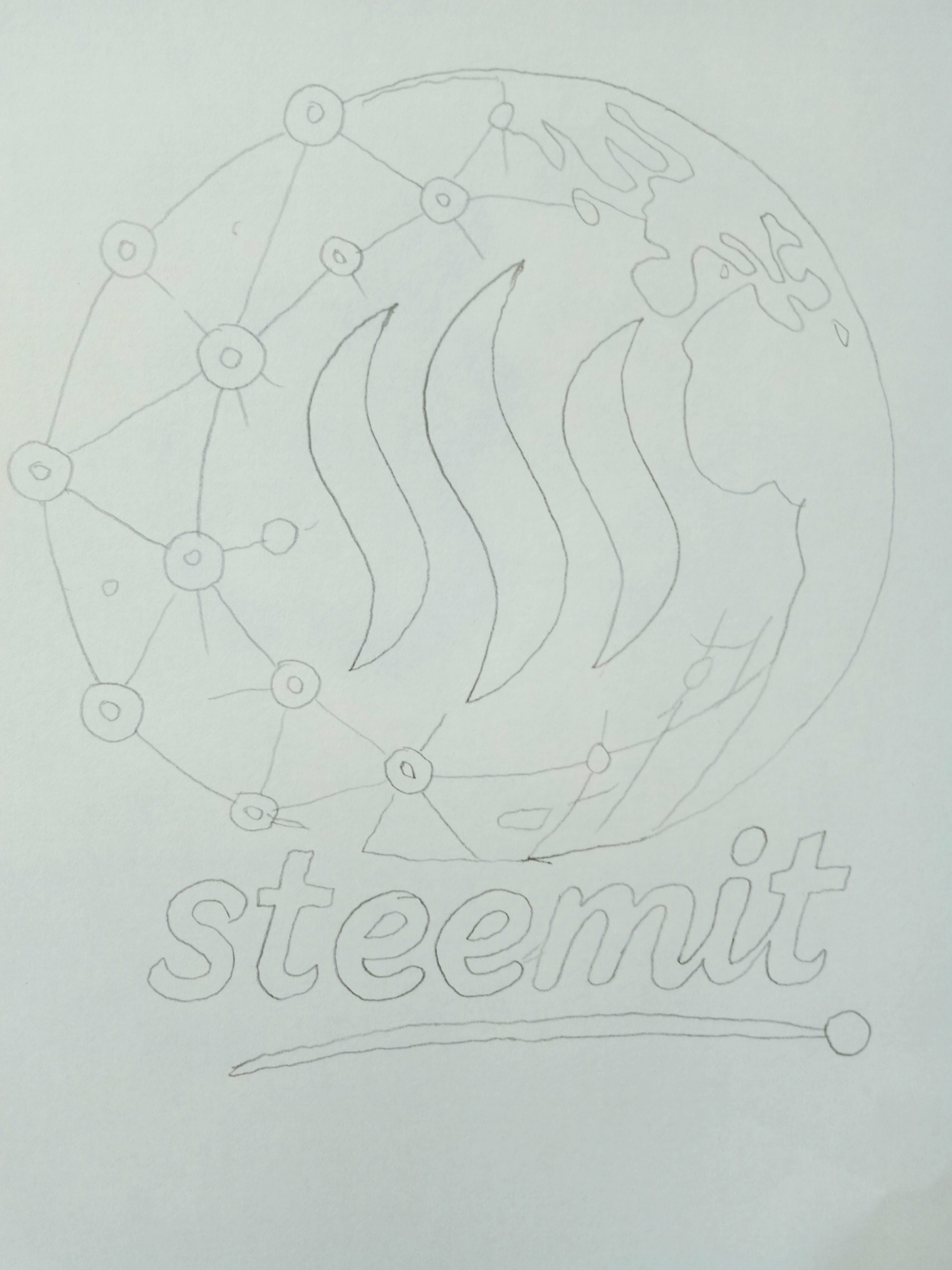
🎨 Step 5
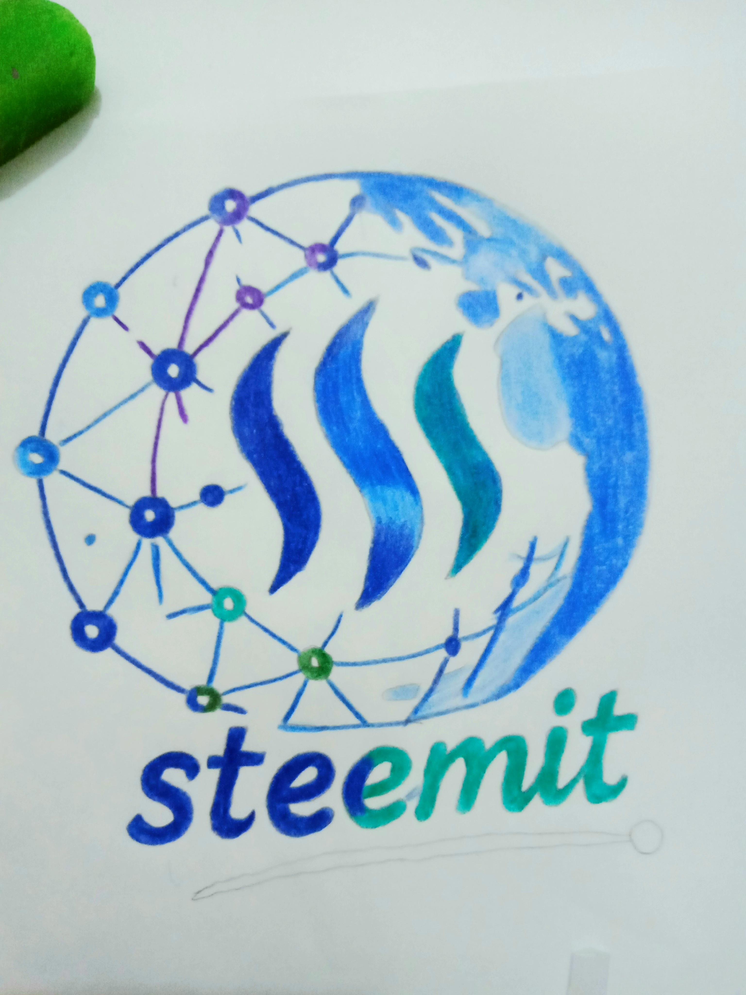
Now I started coloring the main Steemit symbol. I created different variations using dark blue, bright blue and green-blue colors on the three curved parts.
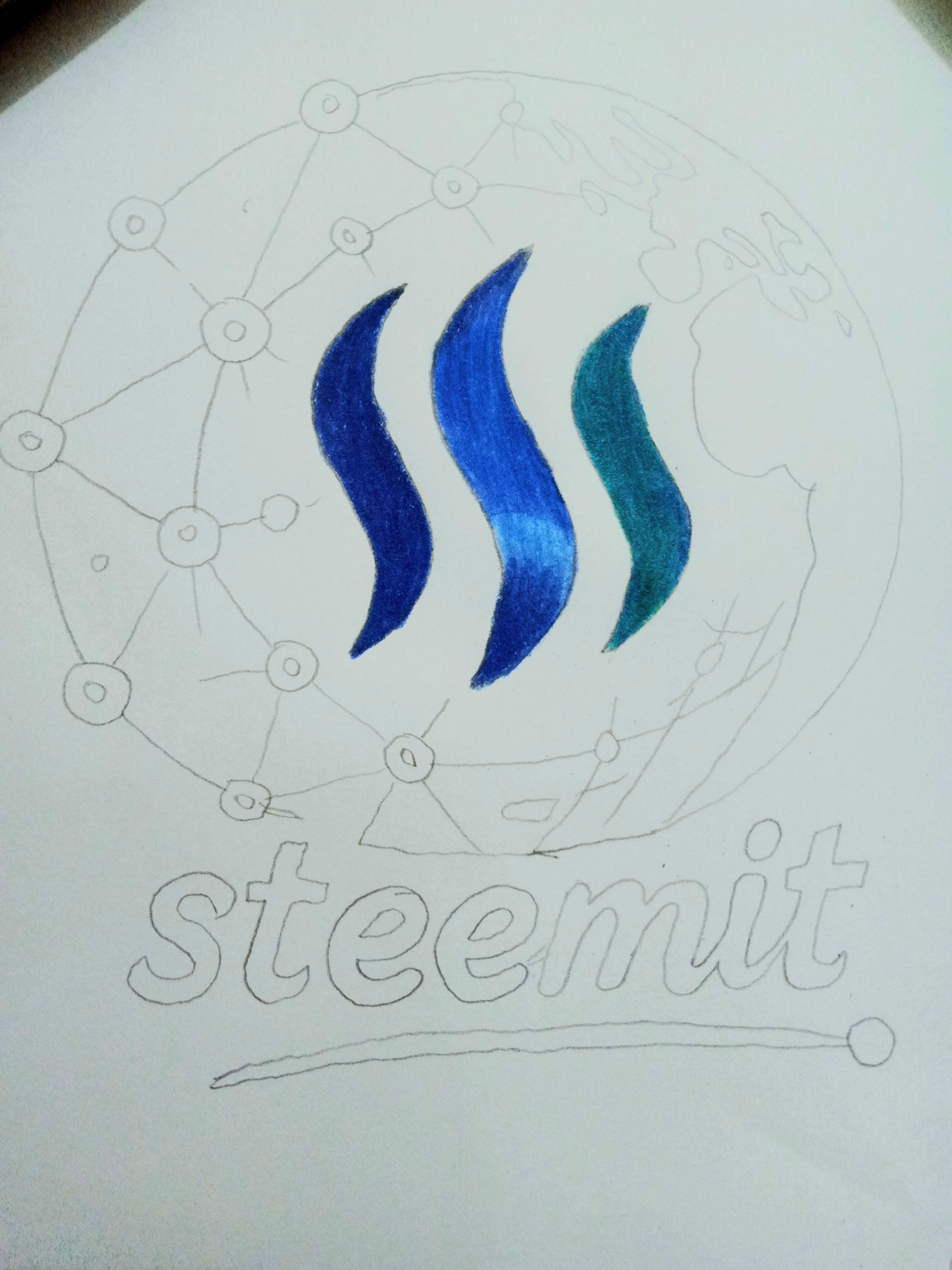
🎨 Step 6
Then I used different colors on the small circular nodes of the network on the left side of the world. I made the network part more vibrant with blue, purple, green and turquoise colors.
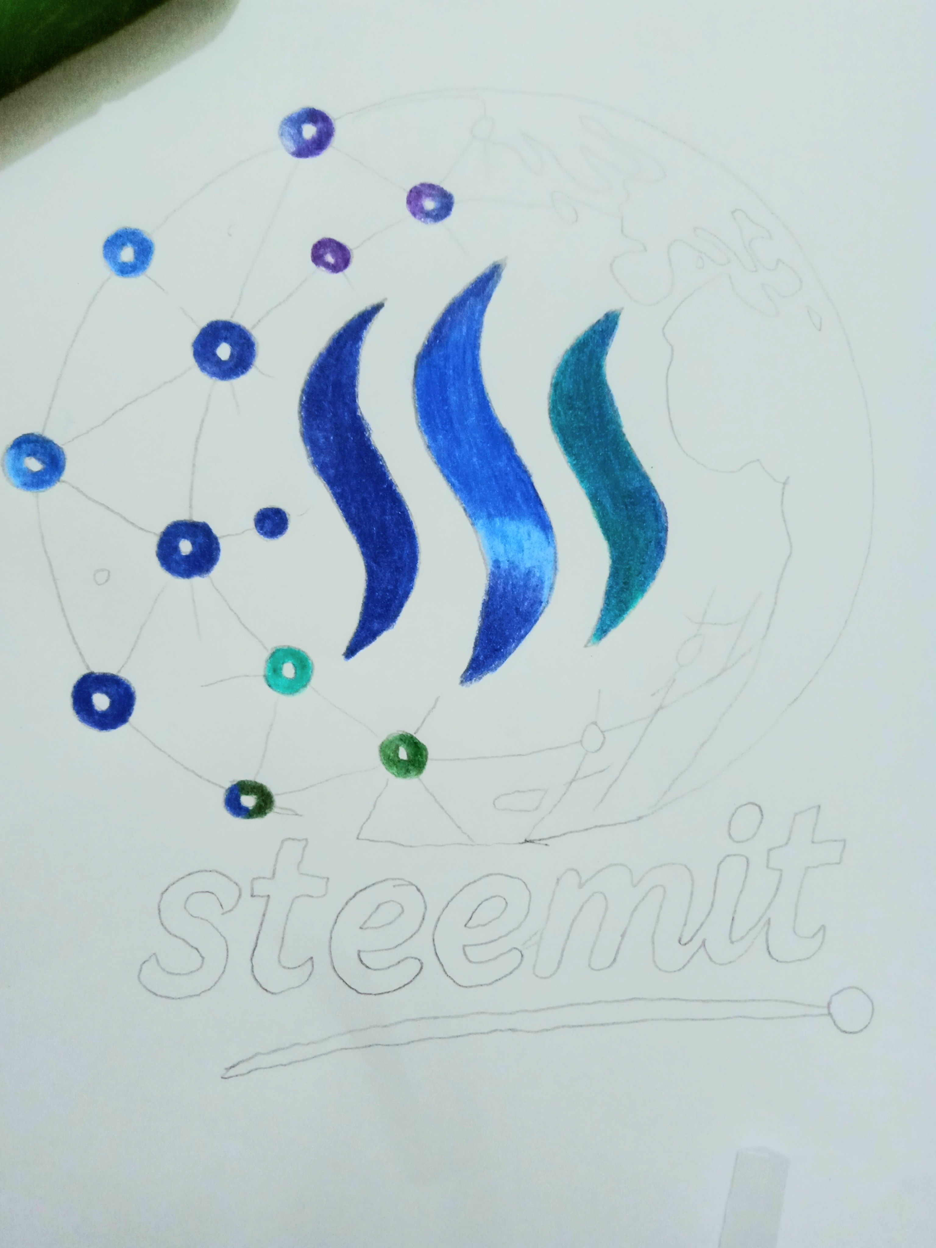
🌍 Step 7
In this step, I gradually created a spread of color using blue on the outer part of the globe. I kept the parts of the continents separate and added different shades of blue to the shape of the globe, so that the design would have depth and variety.
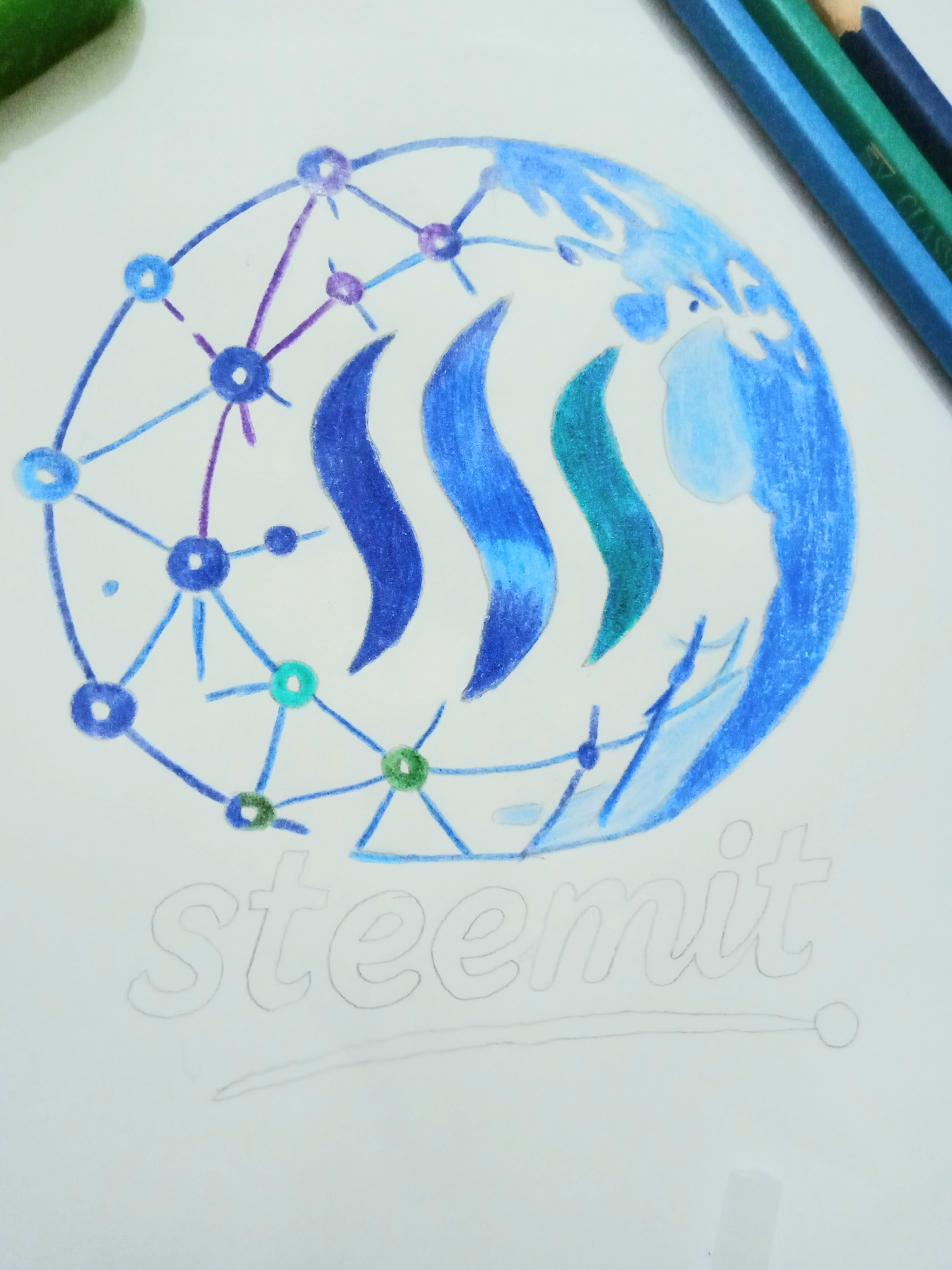
🖌️ Step 8
Then I completed the color work of the rest of the globe and added blue and purple colors to the lines of the network. At the same time, I made the entire design more beautiful by using the necessary colors in the small elements at the bottom.
🖍️ Step 9
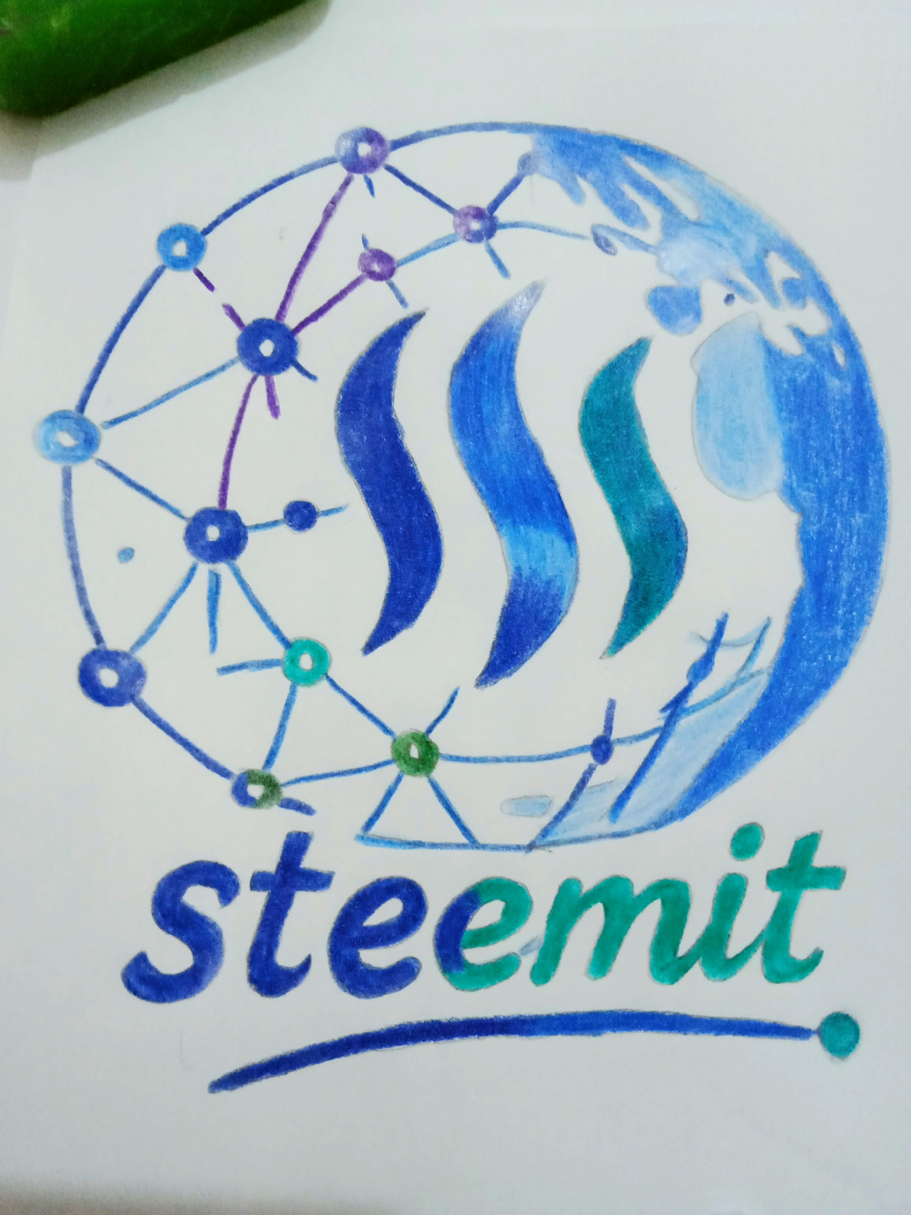
Now I started coloring the text “steemit” in a large way below the globe. I used blue in one part of the text and green-turquoise in the other part. Through this, I tried to create a nice harmony of the text with the colors of the main logo.
🖊️ Step 10
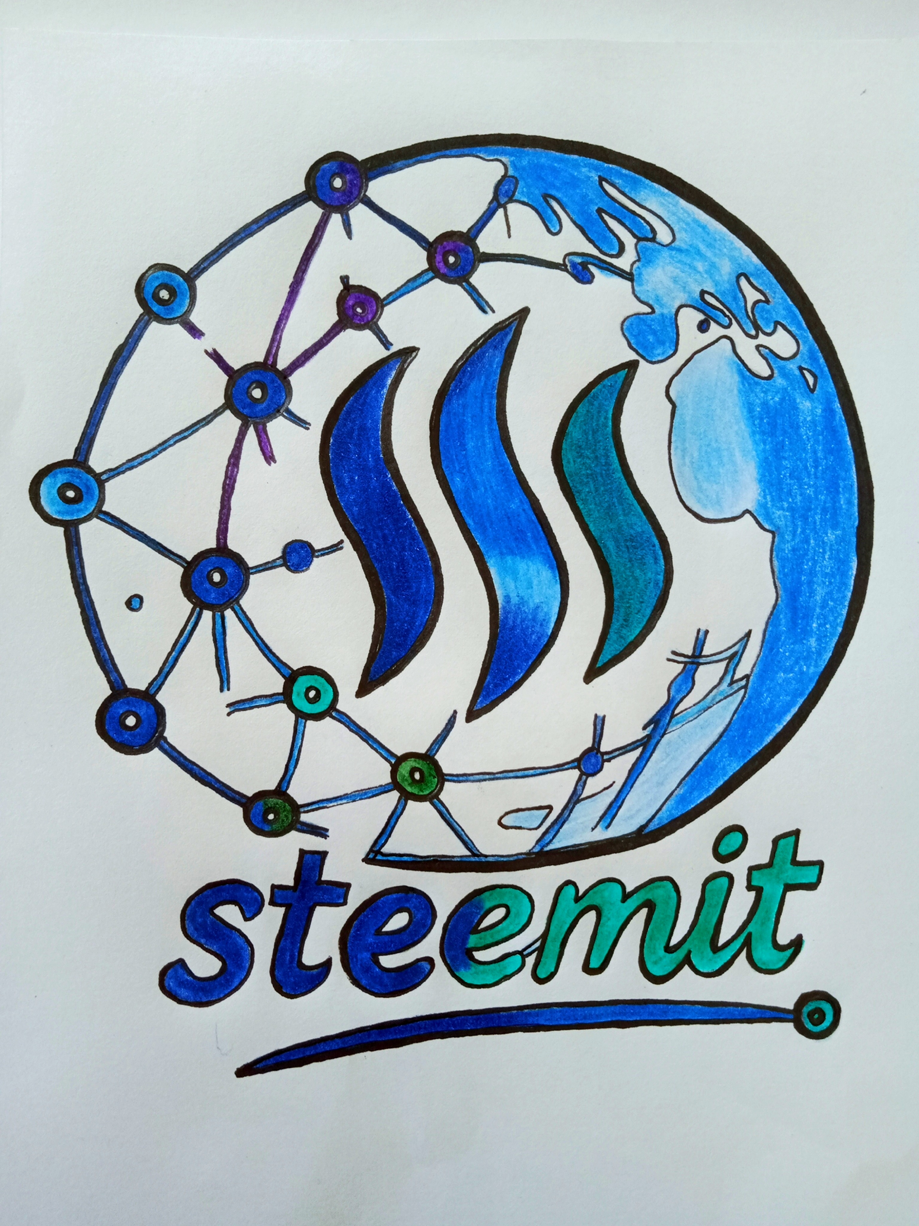
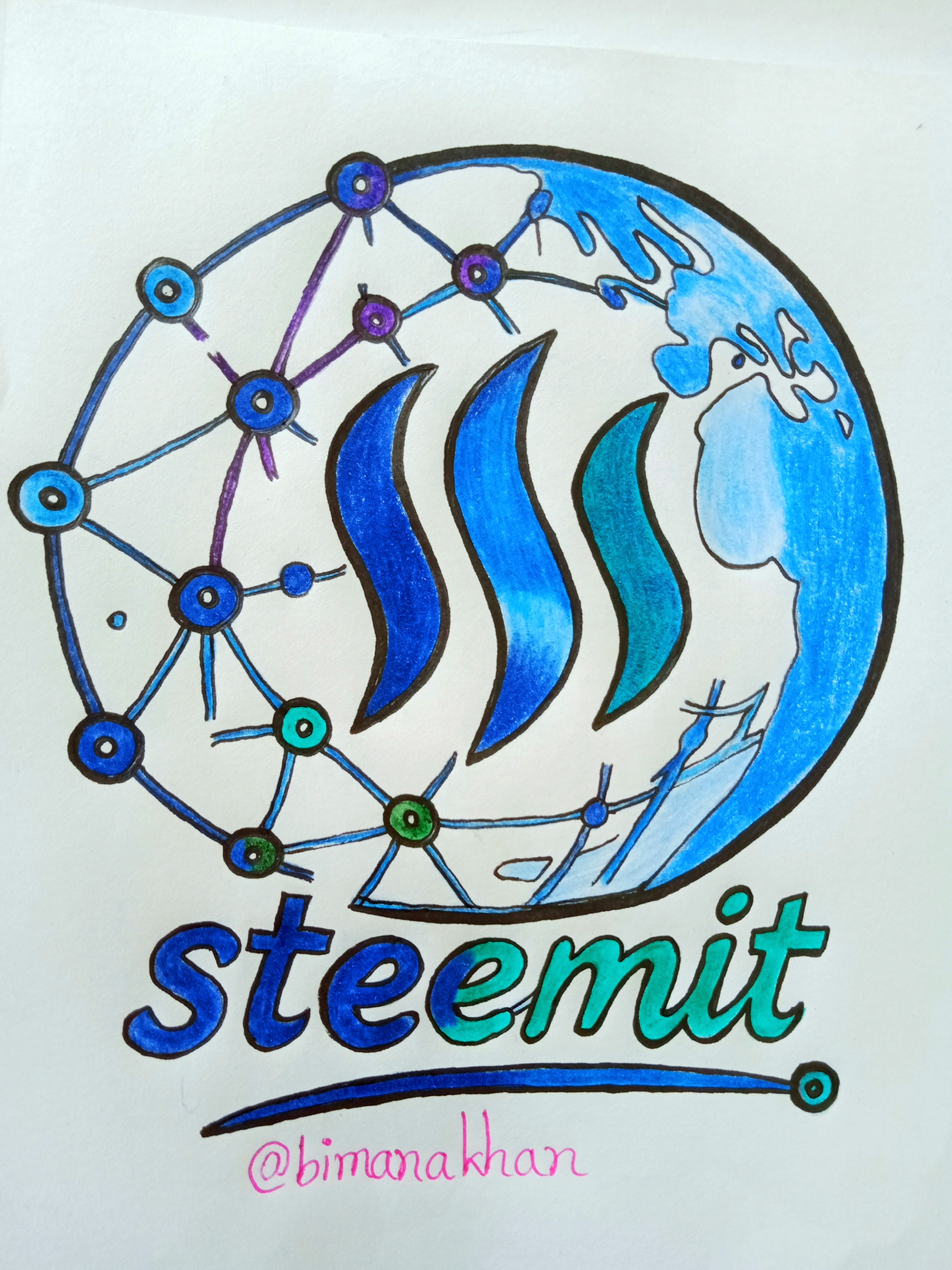
Finally, I clarified the important parts of the entire design with a bold outline. I finished the necessary colors and details by making the Steemit symbol, the boundaries of the world, the nodes and connections of the network, and the text below clearer. Then I wrote the username used by my ID below the logo and ended my drawing process today.
“When a line connects to another line,
then a connection is created.
And countless connections together create a community.”
I tried to portray that idea of connection and community in this design of mine.
The entire time I spent creating this work was a beautiful combination of joy, patience, and creativity. I really enjoyed watching it slowly turn from a simple pencil sketch into a full-color design.
I tried to do something my own way in each step. It may not be a perfect design, but every line and every color has my own time, effort, and love.
It is a great joy for me to have the opportunity to express my creativity through this contest.
Through this small creation, I have tried to present a colorful reflection of the community, connection, and creativity of Steemit.
To those who are viewing my work, your valuable feedback and love are a great inspiration for me. ❤️
🌟 The beauty of every work of art is not only in its perfection, but also in the time, effort, and love behind it.
💙 Keep Creating • Keep Sharing • Keep Inspiring 💚
🙏 Thank you all for viewing my post. 🙏
I would like to invite,
@paholags @sadaf02 @maryam86 @roohiasif99
Thanks alot for reading .
Good luck to you.
Good luck to you.
Bimana Khan

What a colorful Steemit design you have drawn. Amazing look. Thank you so much for the invitation. I liked seeing your post. You have explained the post clearly in a very organized manner. You have explained each step very well. I also liked seeing this. The drawing is also quite good. In the first step, the three arrows you have made with the curved lines were more effective. All your drawings are quite good. Keep up the good work on Steemit.
Thank you very much for your nice comment. It was great to know that you read my post so carefully. You have paid great attention to every point. Thank you very much to you too.
X share,
https://x.com/Bimanakhan/status/2096831905970938118?s=20
স্টূমিটের লোগোটি আপনি খুবই চমৎকারভাবে এঁকেছেন। আপনার লোগোর মতোই বিশ্ব জুড়ে এর প্রচার হোক এবং বিশ্বের মধ্যমণি হয়ে থাকুক। এই প্ল্যাটফর্মের মাধ্যমেই বিশ্বজুড়ে মানুষ একে অপরের সাথে যুক্ত হোক। আপনি লেখাতে যে দুটি কালার ব্যবহার করেছেন সেটি দারুণভাবে মিলেছে।আপনার জন্য শুভকামনা রইল।
এত সুন্দর একটি মন্তব্য করার জন্য আপনাকে অসংখ্য ধন্যবাদ। আপনার মন্তব্যটি আমার খুবই ভালো লেগেছে এটি হৃদয় ছুঁয়ে যাওয়ার মত। আপনার জন্যও শুভকামনা রইল।
Very beautiful love with creativity🩷🩷
#s34engagement
Thank you so much ❤️
Te felicito el diseño quedó muy bonito, los colores representa el mar y todo lo que se trata de navegación.
Le deseo éxitos.
Muchas Bendiciones.. 🙏🏻
Thank you so much..
It was nice to see this drawing, especially seeing all the steps from start to finish. First it was a simple pencil sketch and then gradually the globe, lines and small circles were added, so the whole design started looking quite beautiful. Blue, green and purple colors are also looking good. I also liked that you didn't just make a logo but also showed the community connection through the globe and network. It was really nice to see the whole design in the end. 🎨❤️
#s34engagement
Thank you so much for your valuable and lovely comments. You have observed every step of my work so carefully and have beautifully highlighted the design ideas and presentation aspects ,it has truly inspired me. I especially appreciate the way you have understood the interconnectedness of the community through the globe and the network. Your positive feedback will definitely encourage me to improve my creative work. Thank you again for your valuable time, appreciation and encouragement. 💙